
February 2013, Vol. 240 No. 2
Features
Five Practical Elements Of Effective SCADA Graphics
Good Human Machine Interface (HMI) design is essential to maximizing the value of a Supervisory Control and Data Acquisition (SCADA) system. As SCADA and instrumentation technology has advanced, it has become easier and less costly to add information to the displays.
Providing the controller with more data must be better, right? The answer is “not necessarily.” Well-designed graphics that present the right information (not just data) in the right format actively enable easier identification of and faster action in response to abnormal situations which improves operational performance.
There are numerous guidelines and recommended practices that provide recommendations for effective HMI design such as the Abnormal Situation Management Consortium Guideline Documents and API RP 1165. The Pipeline and Hazardous Materials Safety Administration (PHMSA) 49 CFR Parts 192 and 195 also cover control room management and human factors inclusive of SCADA display design. These documents have wide variation in details but still leave the reader wondering how to create effective HMIs.
Most pipeline companies have SCADA teams but many do not have specialized focus on the HMI design as it relates to human factors and control room management. Improving the design of SCADA graphics, especially when they have been in place for many years, is not necessarily intuitive. A suggested starting point is a gap analysis to rationalize graphics and define requirements. Here are five practical elements to focus on when assessing HMI design for improvement opportunities: 1) consistent and consolidated display layout, 2) information integrity, 3) use of color, 4) alarm handling and 5) navigation.
Consistent And Consolidated Display Layout
Many times, particularly for legacy pipeline operations, there are numerous types and variations of displays. The methodology used to develop SCADA graphics can vary widely and often mimic engineering drawings. SCADA engineers hesitate to delete any of the displays because one controller prefers operating from one display and the next controller prefers another. Consolidating data into useful information and minimizing the number of displays will benefit the controllers as well as the SCADA engineers over the long term.
To be successful, an HMI project requires a cross disciplinary team that includes operators, engineers, and a HMI design specialist. This team collaborates to define the requirements, rationalize the graphics and determine the implementation strategy.
Another common issue is the inconsistency of how information is presented on SCADA graphics. Each time a pump is represented on a screen, the same symbol, faceplate, alarm indication, etc. should be used. The location of standard HMI elements such as titles, alarm information and navigation panels should always be in a consistent location. This helps the controller identify and respond to the operating situation and simplifies training requirements.
Other features of successful SCADA display layouts:
1) Logical organization and groupings of information to enhance clarity
2) Well-organized and uncluttered utilization of display real estate
3) Consistent fonts and font sizes used
4) Labels and abbreviations are easy to understand and used consistently
5) Controller messaging is clear and concise
Information Integrity
One of the most frustrating issues for controllers is when the data on the display is inaccurate. There can be any number of causes such as: 1) instrumentation that has failed; 2) maintenance on equipment or instrumentation that is not clearly identified on the display, and 3) alarms with improper settings.
Regardless of the cause of the inaccurate information, this undermines the credibility of all of the information on the display. As an example, assume that an alarm has been chattering (i.e. crossing the alarm limit threshold repeatedly) so that the controller is acknowledging the alarm with a high frequency over a short amount of time. Does this heighten or lessen a controller’s sensitivity to a “real” alarm occurrence? When “bad actor” or “nuisance” alarms occur frequently over short time periods, they desensitize controllers to alarm activations.
If instrumentation or a piece of equipment is taken out of service, even if only for a short time, it is important that it is flagged in a manner that clearly indicates it is non-functioning. In an abnormal situation, to expect that the controller will be able to identify that a given piece of equipment or instrumentation is out of service is a heavy burden to be placed on an individual.
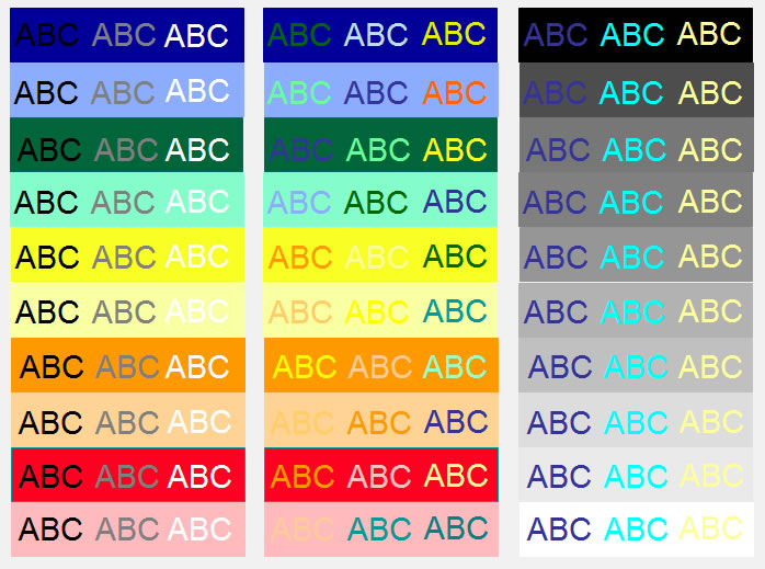
Use Of Color
The use of color is an important part of improving situational awareness. Controller identification and timely response is a direct function of the visual design of the HMI. An HMI that enhances/supports visual processing capabilities will use color and contrast to help the user orient and recognize process conditions and changes. This means that color needs to be used carefully and consistently across all displays. Full intensity, bright salient colors such as red should be used only for critical information to draw the user’s attention.
Color prioritization recommendations.
Urgent/Emergency Alarms: Red
High Priority Alarms: Yellow
Low Priority Alarms: Cyan
Muted colors are best for non-critical information. If full intensity colors are used to indicate many different things, then color becomes less effective and will inhibit the controllers’ performance.
A neutral background such as light gray is the recommended standard for all SCADA graphics. Gray scale and muted colors can be used to convey non-critical information. Black text on a gray background also provides better readability and reduces eye fatigue. There are other options that can be used to convey information such as the process line type (water, air, etc.) Ultimately, if an element needs to stand out for a controller, then the use of colors is justified, or else it is recommended to use muted colors and gray scale.
Alarm Handling
Fundamentally, the first step in good alarm handling at the SCADA graphic is a comprehensive alarm rationalization process. Alarm rationalization entails reviewing each alarm to ensure that it is required, prioritizing identified alarms in an appropriate category and determining the recommended alarm limit settings.
Easy recognition of alarms, their associated degree of severity, and the subsequent controller action required are all vital aspects of effective alarm handling on SCADA graphics. Along with particular color assignments associated with various alarm priorities, there are other recommendations to highlight alarms. For instance, when alarms are in an unacknowledged alarm state, flashing is frequently used to help controllers identify where actions are needed.
(subhed)Navigation
Multiple forms of navigation should be provided and used consistently across all SCADA displays. Common navigation types include: 1) menus, 2) embedded navigation buttons, and 3) dedicated navigation buttons. Effective navigation between SCADA graphics should provide access to any screen in the controller’s span of control with a maximum of two or three clicks. Good navigational flow also supports easy and logical drill down from overview graphics to associated detail graphics.
This can be accomplished by a shallow graphics hierarchy (ideally, four levels) where the operator can choose the level of detail required and quickly find the desired graphic. This structured hierarchy promotes situational awareness and problem solving.
For alarms, the operator should be able to navigate to the graphic page or information about this alarm as quickly as possible. Ideally, this would be one click that can bring up the associated graphic and faceplate.
Conclusions
While there are many factors to consider in determining SCADA display effectiveness, consistent and consolidated display layout, information integrity, use of color, alarm handling and navigation are five key elements that provide a strong starting point for assessing opportunities for SCADA graphic improvements. The best way to determine whether your SCADA graphics are effective is to spend time with controllers to:
1) Understand how they use the displays,
2) Identify what they find useful and challenging with current SCADA displays, and
3) Observe controller actions and responses during high activity periods.
It is advisable that SCADA engineers review HMI standards and best practices to get a better understanding of the elements of good HMIs and what is possible. Developing checklists of key areas and then evaluating SCADA displays against these checklists is one methodology available to assess current SCADA display effectiveness.
For pipeline companies that do not have the resources or expertise to perform these evaluations, hiring HMI Human Factors consultants for assessments can be well worth the investment. Implementing SCADA graphic best practices ultimately enhances controller effectiveness, reduce risk of incidents, and improve overall operational performance.
The Authors
Daniel Roessler is the marketing director for TiPS Incorporated (www.tipsweb.com), an alarm management solutions company. He has an electrical engineering degree from the University of Texas at Austin and has been in the process automation business for more than 20 years.
Lisa Garrison is a principal consultant with Acuite (www.acuite.com) specializing in human factors and user interface design. She has an aerospace engineering degree from Texas A&M University and a master’s degree in industrial engineering from the University of Houston. She has been working as a human factors engineer for more than 15 years.

Comments